| My Role | Timeline | Team Size |
|---|---|---|
| UI Designer, Motion Designer | 2 years | 50+ People |
Description
Revel is a cross platform learning tool for millions of students in higher education, and it is Pearson(the world's biggest publisher for educational books)'s flag tool of digitalization, which allows students to consume over 200 interactive courses.The first generation of the app was not very popular among the users, only getting an average of 3.0 out of 5.0 from the appstores. In 2015, as the only UI designer on the team, I collaborated with UX designers, researchers, product manager, and software developers to deliver high quality design to improve user experience for the second generation.
Delivered Result
-
App rating soared from 3.2 to 4.8 in IOS Appstore
-
App rating soared from 3.0 to 4.0 in Android Playstore
-
Created Peason's first generation of digital design system
Define User Needs
The product has a large number of users with various needs. In order to discover these needs, the team has conducted in depth research by conducting interviews, diary studies and surveys. I collaborated with the UX researchers to dive deep into the research findings and define the key pain points. We identified 3 key areas for improvement.
-
Users suffer from accessibility issues
-
Users lacks motivation for self-regulated learning
-
Users finding the tool unattractive and lacking delightfulness
Design an accessible UI
Test color by using accessibility tools
To make sure that our users would have an equal opportunity to learn, I tested the color schemes in color blindness mode and make sure the color combinations has enough contrast.
Adopt printing branding for digital
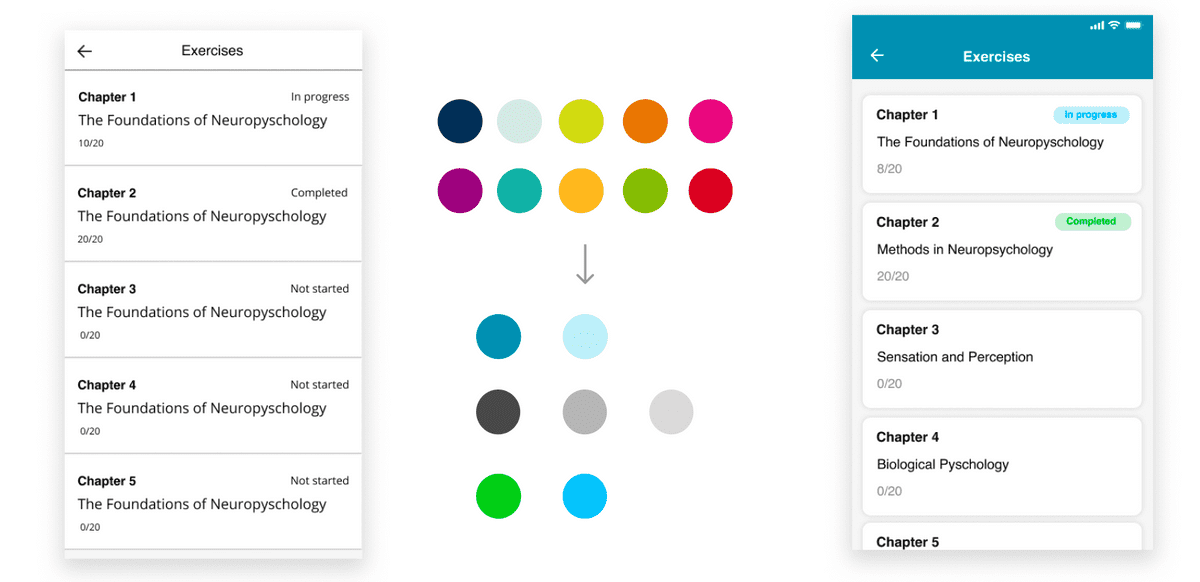
Pearson's branding guidelines at the time was made for printing and did not consider digital. The rainbow color scheme make sense for illustrations, however in the digital version, users are likely to spend hours in the tool and screens are much smaller, therefore I choose to use a monochromatic scheme to allievate the burden for eyes. Also a small number of colors is also more friendly for people with eye impairment issues.
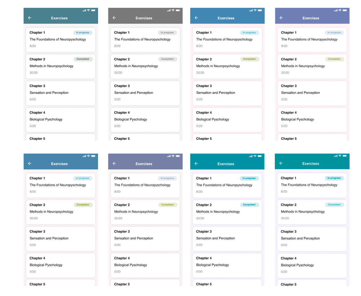
Diverge the design with different patterns
Colors should not be the only way for users to receive information in the app. The users should also be able to perceive information by looking at different patterns. I explored multiple designs to find the best pattern to convey the same information to the users. Besides informational purposes, various patterns also convey different look and feel for the app.
Accessibility is a critical part for UX design, with this project, I had the opportunity to think deeply and create interfaces to make designs inclusive enough to be user friendly for all.
Motivate users to practice
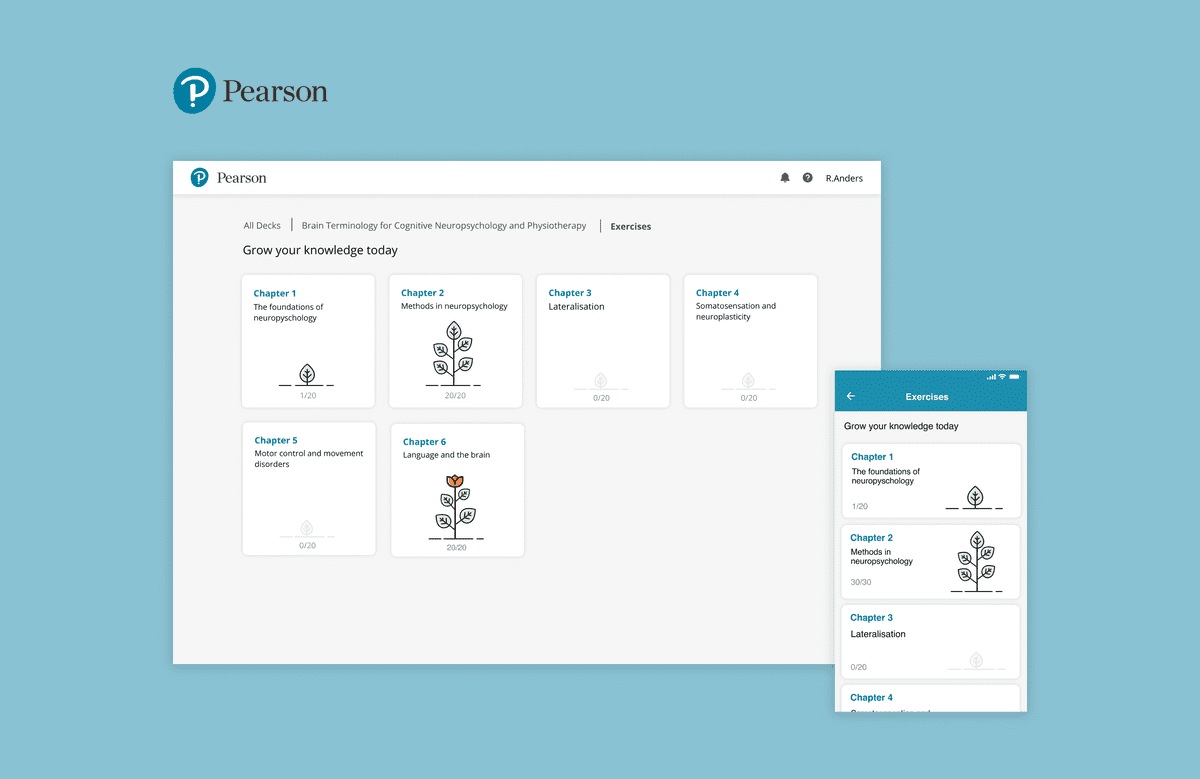
A certain portion of our users are finding themselves less motivated compared to their peers. The regular way of tracking the progress was a dull and less likely to motivate the users. I conducted competitor analysis to see how could we improve. I was inspired by the idea of gamification. I suggested that we could use gamification in our design. I choose to use metaphor as growing a plant to grow user's knowledge with the exercises.
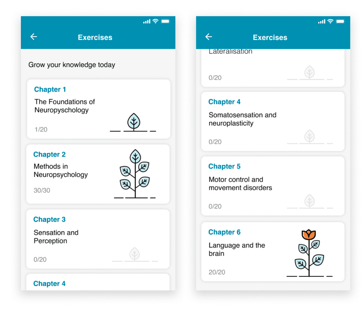
Furthermore, by analyzing the personas of the high performer, I was able to find out that they would repeat exercises multiple times rather then just finish the exercise once like their peers.
Bring delightfulness to the users
Users are finding the learning app unattractive and lacking of delightfulness. In 2015, most apps on the market were still pretty static. Only a few tech giant companies were advocating for the necessity of motion design. By looking into the latest UX trend, I consider motion design a critical element to making the interface more attractive, especially for mobile. For the small mobile screen, it is difficult to add too many visual elements in the design, motion design would be a powerful tool to improve the experience without overcomplicating the UI.


Adjust design for web
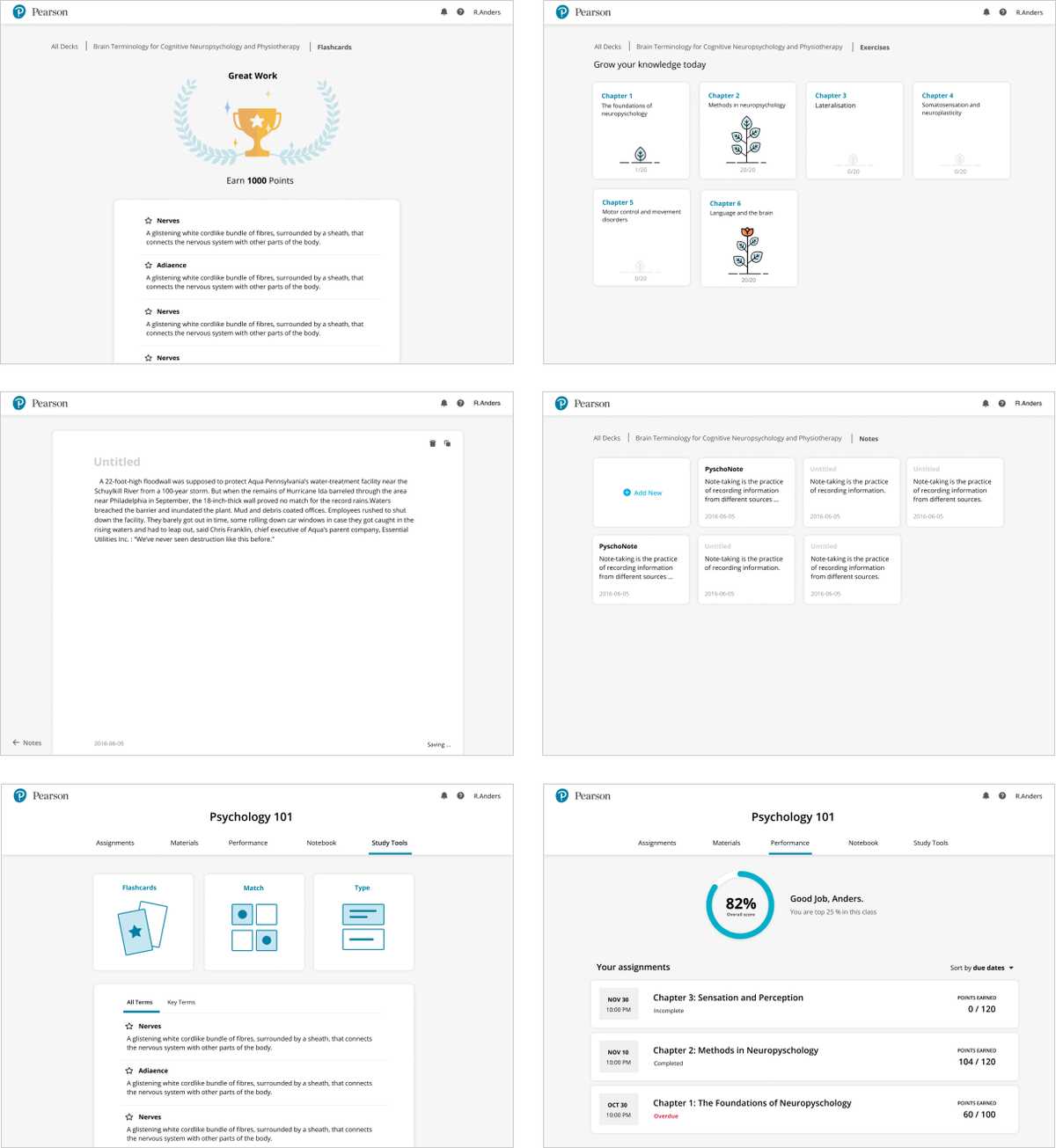
In parallel, I adjusted the mobile design for the web platform by following responsive design methodology and also adjusting animations for the larger screen.
Contributed to a bigger design system
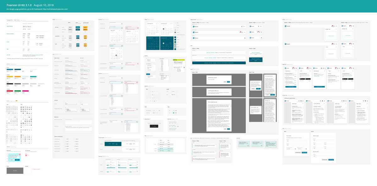
As Revel became more mature, Pearson started the initiative to build a digital design system so we could reuse the elements from Revel and re-apply them to other product lines. I collaborated with our creative director to align on the visual style and see what components could be reused.

Conclusion
By improving the user experience, we successfully improved the user satisfacation by boosting the ratings of the app and received a tremendous amount of positive comments from our users. Yet the success of user experience should be measured in the long term. The next step was collaborating with UX research team again to conduct survey again to understand how each feature in the app is really helping them in achieving their goal of improving performance and using analytics tools to track time spent on the app to come up with the next design goals.